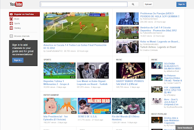
In these changes the core thing you will observe is that the videos are much bigger on the browser page. It has two video options whether you choose small or large player while watching videos, it takes up more space horizontally and add several navigation to confidence you to watch more videos.
Here is a screen shot:
- Home Page
-- Account Links
-- Feed Views
-- Subscriptions
-- Subscription Options
-- Your Feed
- Managing Your Subscriptions
-- Bulk Edit
- Video pages
-- Video at the top
-- Information, subscribe button, sharing options and more at the bottom
-- Playlist appears to the right of the player
If you are conscious about new YouTube design and if you want to ask any question to YouTube developer team then use this link YouTube Help forums.


